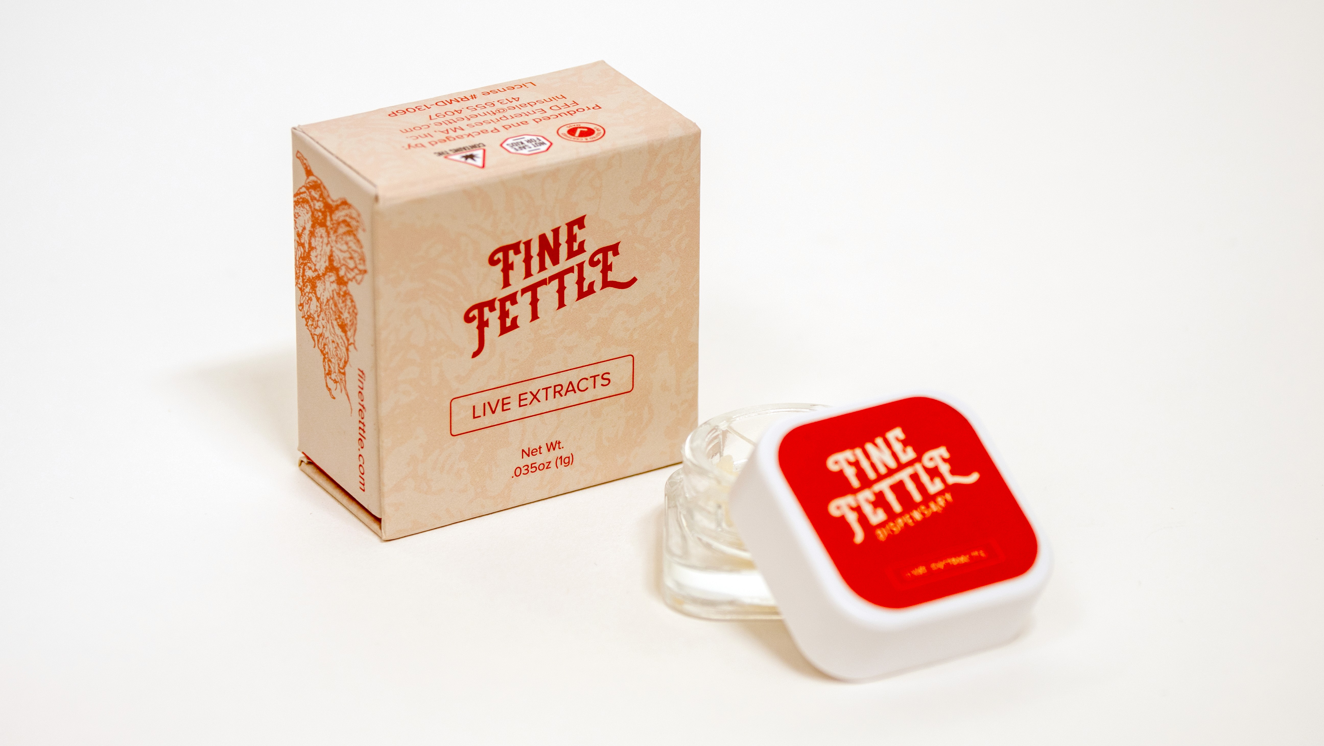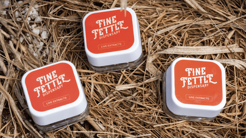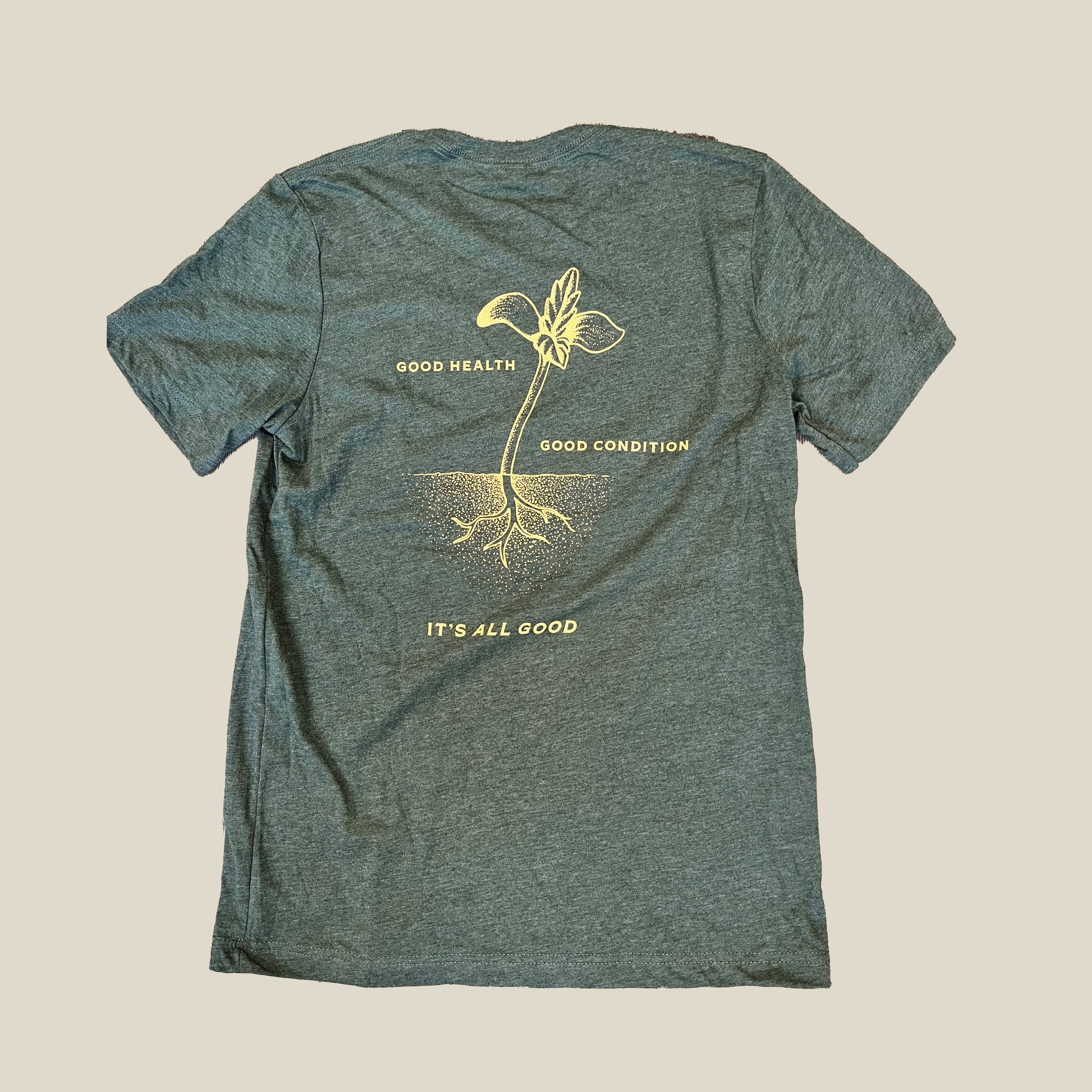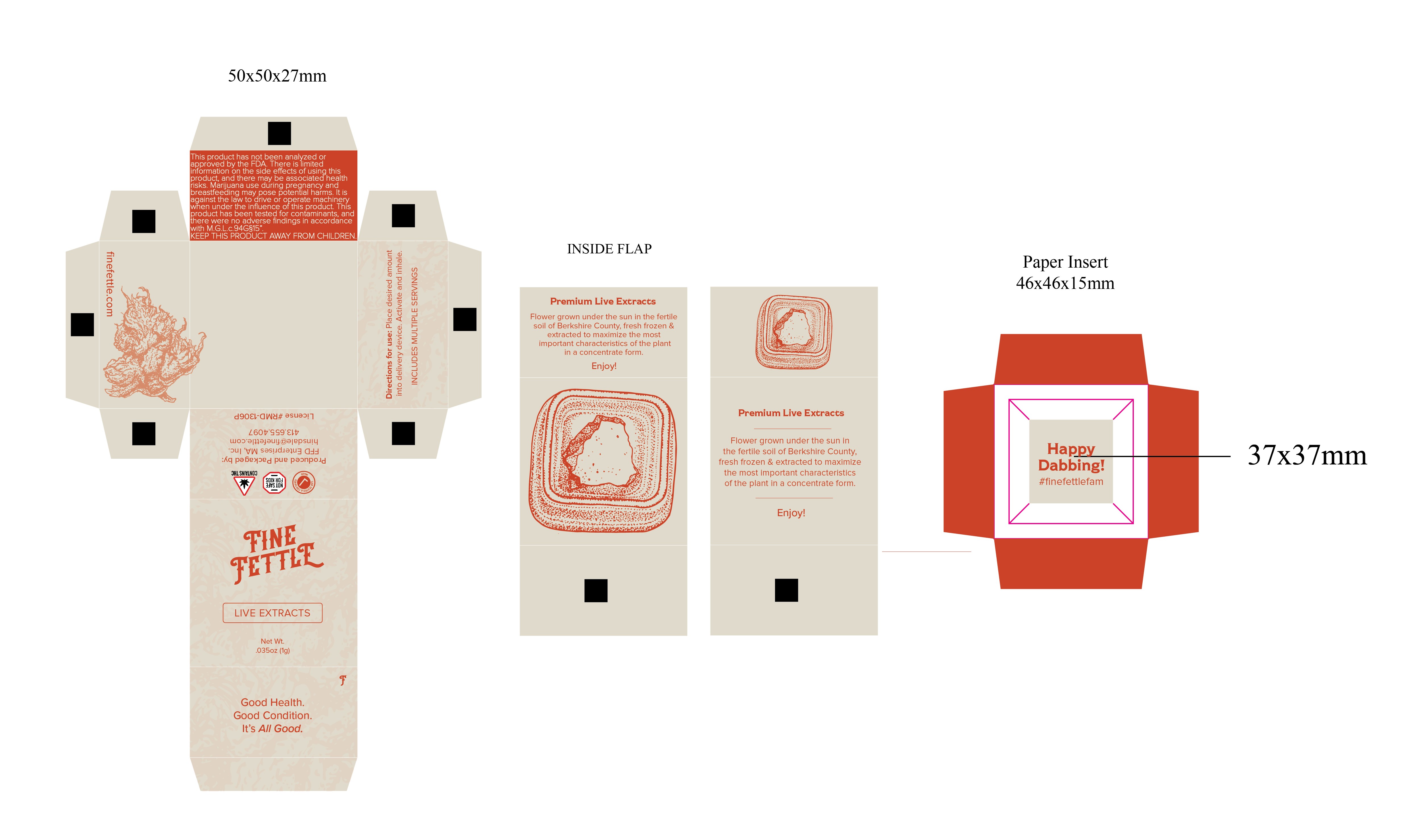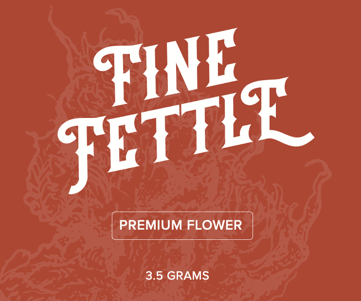
Fine Fettle is a dispensary and product brand. The work done for this client was to produce their first line of in house products. www.finefettle.com Context The challenge was to create a product line for Fine Fettle in their first entrance into the cannabis product market. Approach The design was to include the illustrations that had been contracted in during the brand redesign I had led. The idea was to keep the packaging straight forward so consumers that are familiar with the dispensary locations knew these products were from the same company. Outcome This initial lauch was successful as the packaging led consumers back to the same brand they've become familiar with over time across three states. The signature red color that has become an instant brand marker, along with bringing in the illustration, was the idea to push these new products to market Credits Illustrator David Cadario